2nd February 2021
Virtual Car Team Week 36: Productive evening designing the dashboard for the new car.
Our focus for this week was to design the dashboard for the new car.
The first task of the design process was to create a comprehensive list of all the features and information we would like the dashboard to either record or display. To ensure we covered the needs of our drivers, pit and telemetry crew, we decided to split the team into their typical race day roles before taking in turns to share dashboard features that would be most useful for them to help carry out their specific roles during a race.
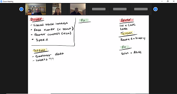
Having created what essentially was a 'Dashboard Wishlist', with ideas such as a GPS display of the track, timer, speed and battery voltage, we went back through the list and discussed the practicalities of each feature. To check we hadn't got carried away (!!), we asked ourselves questions such as; how useful would this be, is this taking unnecessary battery power, what are the added benefits to the driver or is this just a distraction?!
Happy with the list, next we began to look at designing the display. Cate, our resident team designer, took control of the screen and began to sketch out the ideas.
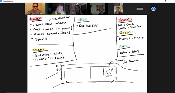
When drawing our ideas, conversations continued on the practicalities of the design and how best to display the information. For the pit crew, their biggest concern was how bulky it may or may not be given all the features to include and whether it would potentially obstruct either the driver or themselves when carrying out a speedy driver change.
Remembering that our cockpit is on the smaller side (...who remembers the week/blog post when we all were asked to get rulers and measure our legs?!?!), Richard pulled up the drawings on Solid Edge.
.....As Richard shared his screen, Cate realised that she hadn't yet saved the drawings and was slightly concerned whether the sketches had been lost. I guess only time would tell!!!!
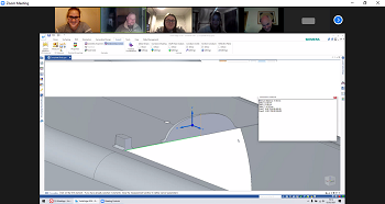
Anyway, back to Solid Edge. With the drawing on screen, we recapped where we had intended the dashboard to be positioned and looked at the proposed measurements. This subsequently prompted discussions on potential shapes of the dashboard and alternative places to locate it in the cockpit.
Before returning to our original sketches, we headed down memory lane and looked at the dashboards from previous cars. This proved to be extremely useful as it re-focused our attention on what part of Basil / Dylan's dashboard we liked and areas that could potentially be improved and become more user friendly. It also triggered conversations on whether we'd prefer the dashboard to show numeric values or whether bars and diagrams would be easier?
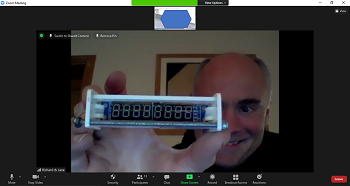
Once we'd finished looking at previous dashboards, we returned to our original sketches.
It was the moment of truth, had the drawings saved or did Richard inadvertently delete everything as he shared his screen.....
...With fingers crossed, Cate began screen sharing and.......

Yes, that's right, Blank Screen!!!!! We had lost everything and Richard most definitely took the brunt of the blame.
.....although I guess you could argue that at least we learnt to always save as we go along!!!!!
Starting with a blank page for the second time, we spent the remainder of the evening bringing all our ideas together to create an Initial Dashboard Design Sketch.
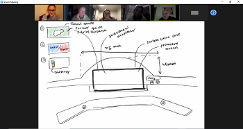
There are still a few things to iron out, discuss, design and test, but we are chuffed to finish the evening having completed our initial design.
A fun and productive evening - what more could we have asked for?!!
See you next week.
